
There is a category of website work that almost every developer knows matters deeply but quietly deprioritizes anyway: accessibility. It is not that we do not care about users who are blind or have low vision. It is that auditing a site for screen reader compatibility feels daunting — it requires specialized knowledge, manual testing with tools like NVDA or VoiceOver, and a working understanding of WCAG guidelines that can take years to internalize.
I assumed my Hugo blog was “probably fine.” It used semantic HTML. It had alt text on images. How bad could it be?
The answer: bad enough that a blind user navigating with a keyboard would have had to tab through every single header link on every single page before reaching any actual content. Bad enough that the search results page loaded new content silently — invisible to screen readers. Bad enough that every social media icon across the header, footer, and share buttons announced itself as a generic interactive element with no description whatsoever.
Claude Code found all of it. And then it fixed all of it.
The Audit: One Prompt, Thirteen Files Examined
I started with a single prompt:
“Verify that the HTML output of my Hugo builds are accessible for those that are blind, meaning that it works well with screen readers, and suggest improvements.”
Claude Code launched a specialized exploration agent that systematically examined 13 template files across the theme — base layout, header, footer, sidebar, post list, search page, taxonomy pages, share buttons, and JavaScript files. It analyzed semantic structure, ARIA attributes, heading hierarchies, color contrast ratios, form labeling, and keyboard navigation support.
The full audit report is available here: Accessibility Audit Report
What it found fell into five priority levels:
Critical (things that actively block screen reader users):
- No skip navigation link — users had to tab through the entire header to reach content
- No ARIA live region on search results — search results loaded silently, invisible to screen readers
- Search inputs missing
<label>elements — placeholders alone are not accessible
High Priority:
- 30+ SVG icons across the site with no accessible text or
aria-label - Mobile hamburger menu with no
aria-expandedstate
Medium Priority:
- No
:focus-visiblestyles for keyboard navigation - “Read more →” links with no context for screen readers
- Tag cloud where font size conveyed popularity — but only visually
- Holiday avatar changes that did not update the image alt text
- An emoji in the footer read as “Purple Heart” instead of “love”
What was working well — and there was a lot — included proper semantic HTML throughout (<main>, <header>, <footer>, <article>, <nav>, <aside>), good color contrast ratios meeting WCAG AA, correct use of <time datetime="..."> on post dates, and a properly set <html lang="en"> attribute.
The Fix: “Implement All Fixes”
After reviewing the audit, I typed three words:
“Implement all fixes.”
Claude Code made 13 changes across template files, CSS, and JavaScript — all in a single focused session. You can see the full diff in the GitHub commit .
Here is a summary of what changed:
Skip Navigation Link
A visually hidden link — visible only when focused — now appears as the very first element on every page. When a keyboard user presses Tab, a blue “Skip to main content” button appears at the top of the screen. One press of Enter and they land directly in the article content, bypassing the header entirely.
Search Results ARIA Live Region
The search results container now has role="status", aria-live="polite", and aria-atomic="true". When results load, the screen reader announces the change automatically, without the user having to navigate to discover that something happened.
Form Labels
Every search input now has a <label> element — either visible or screen-reader-only — properly associated via matching for and id attributes. Placeholder text alone disappears on focus and is not reliably announced by assistive technology.
SVG Icons
Every icon-only link — social media icons in the header, footer, and sidebar; taxonomy icons next to categories and tags; share buttons on every post — now has an aria-label on the link and aria-hidden="true" on the SVG itself. Screen readers no longer announce a generic “image” or skip the link entirely. They announce “GitHub profile”, “Share on LinkedIn”, “Read more about [post title].”
Mobile Menu Accessibility
The hamburger menu toggle now uses aria-expanded (toggled by JavaScript as the menu opens and closes), aria-controls pointing to the navigation element, and aria-label that changes between “Open navigation menu” and “Close navigation menu.”
Focus Styles
Every focusable element — links, buttons, inputs — now has a visible 3px blue outline when focused via keyboard. This matters for low-vision users who navigate with a keyboard but can still see the screen.
Tag Cloud Counts
The tag and category cloud pages used font size to convey popularity — bigger text, more posts. Screen readers could not perceive this. Every cloud link now has an aria-label that includes the post count: “accessibility, 4 posts.”
Holiday Avatar Alt Text
The site swaps the profile avatar image on holidays (Christmas, Halloween, Valentine’s Day, and so on). Previously the alt text remained the same regardless of which holiday image was displayed. Now each holiday swap also updates the alt text: “Profile avatar celebrating Christmas.”
Emoji Accessibility
The footer contained 💜. Screen readers would announce this as “Purple Heart” — technically accurate but tonally wrong. It now has role="img" and aria-label="love".
Why This Matters
According to the World Health Organization, approximately 2.2 billion people worldwide have a vision impairment or blindness. In the United States alone, roughly 7 million people have a visual disability. These users depend on screen readers — software like NVDA, JAWS, or Apple’s VoiceOver — to navigate the web. Every unlabeled button, every missing form label, every dynamically loaded content region that fires silently is a wall.
Consider what navigating this blog was like before these changes for someone using a screen reader:
- Page loads. Screen reader begins at the top.
- Announces: “link, link, link, link, link, link, link, link, link, link” — ten unlabeled social media icons.
- User tabs through the search form. No label. Just “edit text.”
- User reaches the mobile menu button. No state. Is it open? Closed? Unknown.
- User finds the post list. Clicks “Read more.” Screen reader announces: “Read more.” Read more what? No context.
- User navigates to the search page. Types a query. Results appear. Screen reader: silence.
After the changes:
- Page loads. First focusable element: “Skip to main content — link.”
- User presses Enter. Lands directly in the article list.
- “Read more about How I Used Claude Code to Make My Blog Accessible in Minutes — link.”
- User navigates to search. Types a query. Screen reader: “3 results found.”
The difference between these two experiences is the difference between a site that is usable and one that is not.
The Bigger Picture
What strikes me most about this exercise is not just the outcome — it is how low the barrier was. I did not need to become a WCAG expert. I did not need to install a screen reader and manually test every page. I typed one sentence and got back a prioritized, detailed audit that would have taken a professional accessibility consultant hours to produce.
Then I typed three more words and got all the fixes implemented correctly — with appropriate aria-hidden on decorative elements, proper live region semantics, aria-label text that actually makes sense when read aloud, and a .sr-only CSS utility class that visually hides elements while keeping them accessible to screen readers.
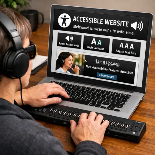
The accessibility awareness does not stop at a one-time audit, either. When inserting an image into any blog post, Claude Code reads the actual image file, visually analyzes its contents, and writes the alt text based on what is literally depicted — not the filename, not the post title, not an assumption. The hero image at the top of this very post, for example, was described as “Person wearing headphones using laptop showing an accessible website interface” because that is exactly what the image shows: a person, headphones, a laptop, and an accessible website on screen. That description is what a screen reader user hears. Getting it right matters, and having it happen automatically on every image insertion means it is never skipped.
There is no longer any reasonable excuse for a small personal blog — or any website — to neglect accessibility. The tools exist. The knowledge is available. And with AI coding assistants like Claude Code, the implementation time is measured in minutes rather than days.
Your users who cannot see your beautifully designed site still deserve to read your content.
What accessibility improvements have you been putting off? Could you audit your own site today with a single prompt and finally ship the fixes you know you should make?